New logo, clip changes and a new way to browse clips (beta).

Skip to the end to go try it now!
So a quick update
Just a short blog, or at least that's the intent but isn't it always.
As is tradition, changes were made then days later a blog about it was posted :p
New Logo
The first thing you may have noticed is we have a new logo, much thanks to Lilly one of our HasRoot team members who has been helping me become a better web developer since Joined Nov 26, 2019.
She has often questioned my designs, given valuable feedback and helped me learn to make cleaner, nicer designs. Without her HasRoot would (and did) look a lot worse. There is still a lot I want to improve but my TODO list is huge.
The old Logo
That being said, the initial logo was horribly made by me when I made our discord. Until then I don't think we even had a logo or any branding.
I designed it to resemble our graphs, use our colours and incorporate the HR theme, via a square root symbol. I did initially try to just make a HR symbol but it looked awful as a favicon. It didn't scale well, I also kept making different versions of it whenever I needed a logo and it was just ugly.

I liked it a fair amount, and then when I uploaded it to discord of course it then had a circular outline, which I also liked and that made it into the next iterations of the logo, and the favicon.

The Redesign

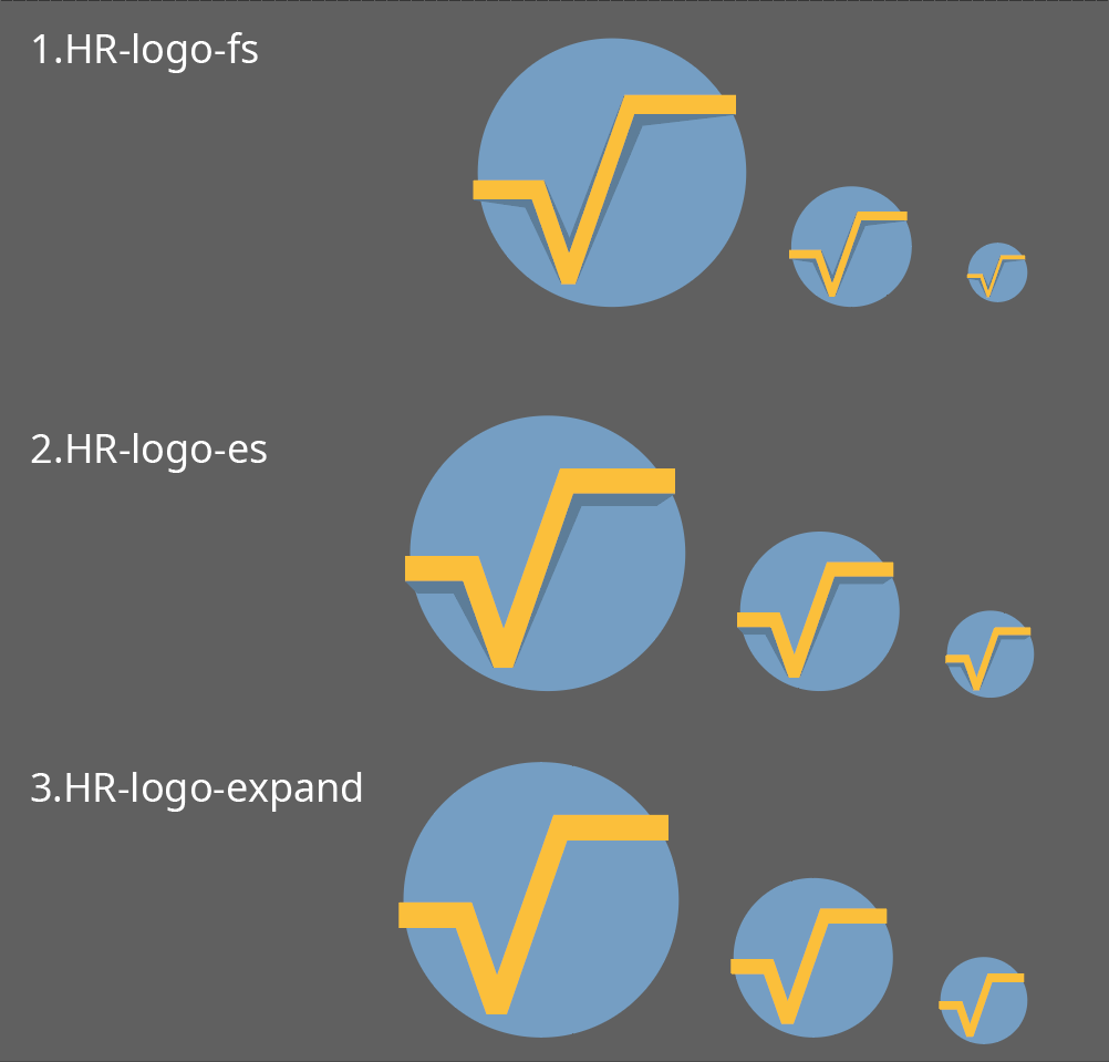
So recently I asked Lilly if she would be up for remaking our logo, and I was excited when she agreed. She made a few alternate versions for feedback and admittedly I tried to sabotage her with my 90s old school design sense. We put it to our HasRoot team and discord users to decide the best direction, my awful retro made in paint version got one vote (I wonder whose).
Making a logo is a very hard task, it has to be simple, distinct but look good at the same time. I think Lilly captured all the vital elements and just improved on them while adding in things I initially rejected. Like the lines going outside of the circle, which I now love.
Lilly's design statement
This options are not super different from original, because I wanted to awe original design of HasRoot logo that is not a bad logo. Going to logo and why I did what I did: ScottishRambler works his ass off to expand functionality of the service and I wanted that represented as arms of the square root symbol (not pulse line).
We expand every month and improve so the arms are reaching and circle is us. Circles of roleplayers. In fact we all connected by passion to Roleplay on all different stages and games, so arms of the symbol are reaching out of it because that circle expands and changes so is HasRoot.
The new Logo

I am super happy with the result, much better than I ever thought it could look after making my simple version ages ago.
Lilly really nailed it IMO, almost makes me want to put it on a tshirt :P
Thank you Lilly! She also does freelance logo, branding, emoticons and other design work if you're looking for something done.
Clips changes
Something else you may have noticed was clips are slightly different now, the clips page has been given some space to breathe and sizing and behavior has changed. I ended up rewriting a bunch of clips stuff for a new feature I have been working on, more on that later.
It also comes with auto play that works on mobile and new clip resizing capabilities. Definitely a lot better than it used to be.
Icons load faster POG CHAMP
I have been using Font Awesome for icons for nearly as long HasRoot has existed (nearly 4 years) and they have always been very slow to load. The page loads, then a second later the icons load.
Well when working on the new clip feature I decided to finally address that.
I googled around and found a way to build the font awesome package for ONLY the icons we use, this means it loads MUCH faster and the icons should basically be instant.
(Hopefully I actually imported all the ones I used, but if you see any confusing broken items or question marks, let me know so I can fix it)
The launch of a feature I long wanted
My dream for a proper clip feature was always here's a clip, then go back / forward in time to the next cool clip. The idea had performance issues, design issues, lot of issues.
It was always something I wanted to tackle and knew it would be a cool feature.
If you are active on our discord you will have been aware of it. I 'launched' a prototype of it there months ago but have been slowly updating and refining it. I kept thinking OK it is nearly done, I will release it this weekend.
As is tradition I was never happy with the final result, always finding some issue I didn't like about it. You can check the discord for some of the iterations and additions. I may make a proper blog about the stages and changes when I OFFICIALLY launch it.
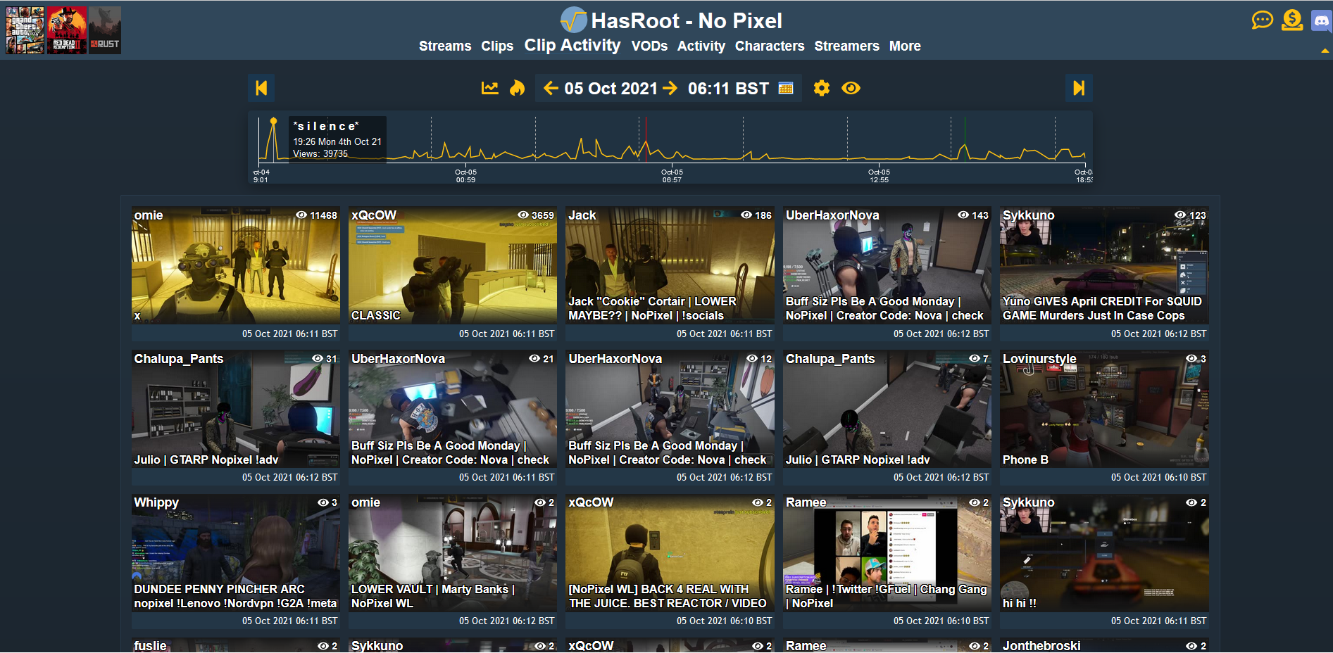
Still debating how to handle it in the menu, I will also be updating the clips page to make it better soon but it has been benefiting from the clip activity update. That being said both features will continue to exist, it is just a different tool.
TL;DR
https://nopixel.hasroot.com/clipActivity.php
Check it out, let me know what you think (it still probably needs work, and you will get a huge wall of text about how it all works but once you close it, you won't see it again.)
It 'works' for all servers we track, just change via the menu as per usual. The only way to get to that page though currently is via the direct link, I will add it into the full menu once I am satisfied with its scalability.
Thanks again Lilly for our much improved logo, took my original design and made it much better.
As usual I hope you are all enjoying the site, if you have any feedback always feel free to get in touch. I have been awful at going through the site feedback lately, so if you want a prompt response, discord is your best bet.
All the best,
Sean - ScottishRambler
(So much for short)


