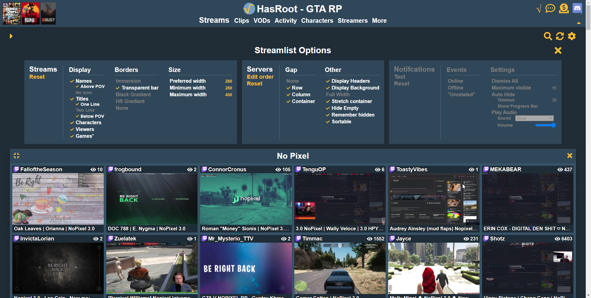
Gradients gone, default stream size changed and a reminder that you can customise the streamlist via the new options. Also proposed new defaults for the streamlist included.
As you have probably noticed I have relented and removed the gradients lol, they didn't go down well so I figured we would just go back to the solid colours. I actually quite like it but I do sort of miss them (at least the header gradient). I implemented the 'flat' mode as a theme for the site so when I do add theme selection it'l be an option for anyone who did like it.
I also upon advice from feedback and playing with the stream list settings decided to reduce the default preferred width for the streams. This resulted in an extra column in most of my tests of different window sizes, even with gapping enabled.
Potential changes to defaults

I am also probably going to go further however and change the defaults to those shown in the right. The new stream list options system allows for a lot more customization than the old ones did, so if you haven't checked it out you should have a play with it. If you have any suggestions for different options I should add let me know as the new system for them is pretty simple and flexible.
You can check out of a vid of me showcasing some of the features here: https://i.imgur.com/VLbVkj2.mp4
After some feedback on the new update I had a play around with them and I think these are prolly much better defaults than the 'Wall of PoVs' we launched with. It goes back to the old sort of style and look of HasRoot and I do think overall it is more functional, easier to read and just better. I started the streamlist update with the idea of borders = bad, and may have went a little too far.
I do think there are some people who would prefer the wall to wall POVs and this is why I added a lot of configuration options. So all you would have to do in that instance is just turn off all the gaps and above/below POVs. I really should add some presets so that people can try different groups of settings but that wont be immediate.
If you prefer the 'classic' look over the 'wall of PoVs' or vice versa let me know via the feedback function or on discord.
Hope you are all enjoying the site and thanks for putting up with the random changes going on.
All the best,
ScottishRambler


